Artworks Park Inn Zurich
Background and brief
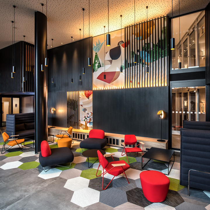
Lobby design and its custom-made wall graphics follows on Park Inn Next Generation brand style, aimed at young and youthful world travelers who seek for a functional, tech and space-savvy, transparent and dynamic interior, with a powerful use of colours.
Our Solution
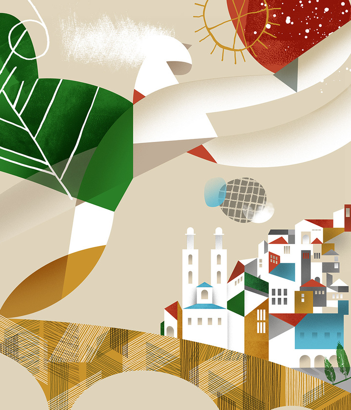
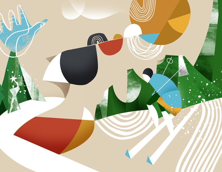
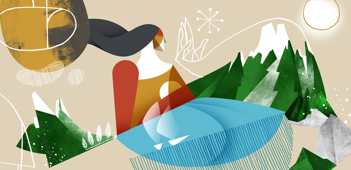
The inspiration for artworks we took from the very rich art history of Zürich in the 1920ies. It was the time of breaking the art norms and rules, expressionism, surrealism, dadaism - whose official hometown is Zürich - that changed the way things were depicted and seen. In the artworks we played with composition and forms, there are clear references to Tete Dada in form and shape, and Le Corbusier’s numerous pencil drawings, but we still wanted to keep clear associations with what Switzerland is famous for - beautiful nature, lakes and mountains - and, naturally, add some landmarks of Zürich itself. We hope that hotel guests will find these graphics uplifting and visually engaging.
Services Provided
Project Completion Date
Winter 2017
Project Team
Booboo Tannenbaum
